

A newsroom homepage treated like a product: The Verge’s three-tier feedback triage
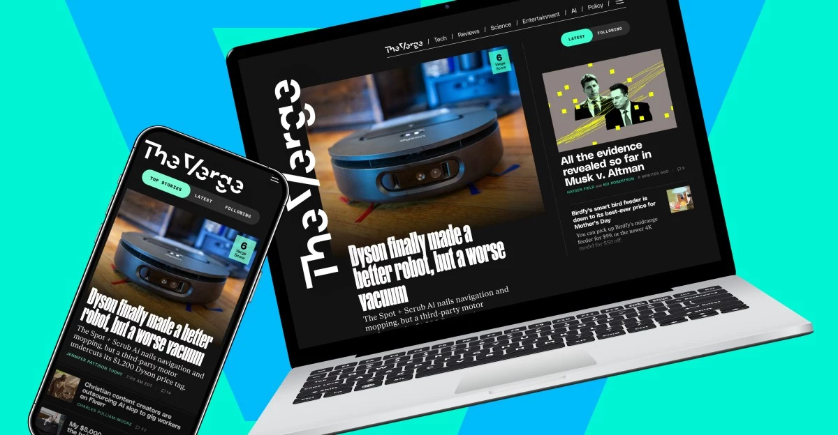
The Verge’s redesigned homepage is being shaped in public through a structured, three-tier feedback framework—a move that reads less like a traditional “site refresh” and more like modern product operations. Instead of treating reader reactions as a single, undifferentiated stream, the organization is explicitly separating input into:
- Immediate fixes (fast, high-confidence changes)
- User-driven enhancements under evaluation or development (features with meaningful UX and engineering implications)
- Deferred requests (ideas acknowledged but not prioritized)
That triage model matters because it signals a deliberate shift in how digital publishers manage experience design: not as a one-off redesign cycle, but as an ongoing iteration loop with visible decision-making. The immediate changes already shipped—such as removing a persistent scrollbar and adding “Read More” links—are small on paper, but strategically important. They reduce friction quickly, demonstrate responsiveness, and prevent minor usability issues from distorting perception of the broader redesign.
Equally notable is the constraint The Verge is candid about: a small product team. In today’s media economy, that’s less an exception than the baseline. What differentiates operators is not headcount, but the discipline to prioritize, communicate tradeoffs, and keep shipping improvements without accumulating chaos.
UX signals: why “Latest,” dark mode, and read/unread states are more than cosmetic
The second tier of feedback—features like a chronological “Latest” feed, dark-mode support, visible story dates, and read/unread toggles—points to a deeper tension in modern publishing: the balance between editorial curation and user control.
A chronological feed is not merely a layout preference. It is increasingly a trust and transparency feature, shaped by a broader “algorithmic backlash” across platforms. Users who feel manipulated by opaque ranking systems often ask for a simple guarantee: show me what’s new, in order. For a publisher like The Verge, experimenting with a “Latest” view can function as a hedge—offering a predictable, user-curated pathway alongside the more intentional, editorially designed homepage.
Dark mode, meanwhile, has matured from a “nice-to-have” into a session-length and accessibility lever. It can reduce eye strain, improve perceived comfort in low-light contexts, and—crucially for publishers—encourage longer reading sessions. Visible dates serve a different but equally strategic purpose: they support content provenance and reduce confusion in fast-moving technology news cycles where recency is part of credibility.
Read/unread toggles are perhaps the most product-like of the set. Once a publisher introduces statefulness—remembering what a user has consumed—it opens the door to a more personalized experience without necessarily relying on heavy-handed recommendation algorithms. Under the hood, however, these features typically require stronger foundations:
- More consistent metadata tagging (timestamps, content types, section taxonomy)
- CMS and front-end coordination to ensure feeds can be rendered in multiple modes (curated vs. chronological)
- User state management (cookies, accounts, or privacy-preserving local storage patterns)
- Analytics instrumentation to measure whether these changes improve return visits, depth of reading, and subscription propensity
In other words, these enhancements are not simply interface tweaks; they are incremental steps toward a homepage that behaves like a configurable product surface—one that can later support AI-driven recommendations or smarter navigation without forcing a disruptive rebuild.
The economics of prioritization: engagement ROI vs. subscription feature gravity
The third tier—requests that are explicitly off the table for now, such as the return of Free-to-Read and Subscriber Perks modules or major layout reversals—reveals the economic logic behind the roadmap. Digital publishers are operating under volatile ad markets and tighter budgets, which makes prioritization a question of return on effort.
From a business perspective, the near-term calculus often favors improvements that lift broad engagement metrics:
- Faster comprehension and navigation (e.g., “Read More” links, clearer structure)
- Higher repeat visitation (e.g., “Latest” feed, read/unread cues)
- Longer sessions (e.g., dark mode, reduced friction)
These can translate into more page views, stronger ad inventory performance, and better audience retention—benefits that apply across the entire readership.
Subscriber-centric modules, by contrast, can be strategically powerful but operationally complex. They require careful coordination across editorial, marketing, and product, plus ongoing maintenance to keep perks meaningful. Postponing them may reflect a belief that the homepage redesign’s first job is to stabilize the core experience before layering on membership mechanics.
That said, the risk is real: if subscription incentives remain underdeveloped for too long, publishers can face churn pressure—especially as competitors refine membership bundles, exclusive newsletters, events, and community access. The Verge’s decision to defer these elements is not a dismissal of subscriptions; it is a sequencing choice. The strategic question becomes how quickly “deferred” turns into “designed,” particularly if ad growth remains constrained.
Transparency as a competitive moat in digital publishing and platform design
Beyond the specific features, The Verge’s most consequential move may be cultural: publicly narrating the triage process and inviting ongoing feedback through multiple channels. In an environment where audiences are skeptical of silent changes and opaque ranking logic, transparency becomes a form of brand equity.
This approach also mirrors best practices from high-performing technology organizations:
- Rapid iteration on obvious pain points to prevent technical debt from compounding
- Research sprints for ambiguous feature requests to avoid building the wrong thing
- Clear “not now” boundaries that preserve focus and reduce roadmap thrash
If The Verge pairs these UX upgrades with stronger analytics—measuring how chronological feeds affect recirculation, how dark mode influences session duration, and whether read/unread states increase return frequency—it can turn a redesign into a durable experimentation platform. The publishers that win the next cycle won’t be those that redesign most dramatically; they’ll be the ones that ship continuously, measure honestly, and earn trust through clarity—treating the homepage not as a static front door, but as a living interface between journalism, audience behavior, and sustainable revenue.

 By
By
 By
By

 By
By

 By
By