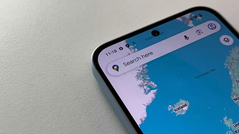
Google Maps, the trusty digital navigator that has guided us through countless journeys and occasional wrong turns, is undergoing a facelift. As part of its latest update, Google Maps is simplifying its bottom menu from five options to just three. This streamlined approach was first introduced during this year’s Google I/O conference, and it’s now rolling out to users, starting with Android aficionados.
For many devoted users, the current five-button setup has become second nature. The options—Explore, Go, Saved, Contribute, and Updates—have been our digital compass, guiding us through bustling cities and quiet countryside alike. However, Google has decided to mix things up a bit. The new streamlined menu will only feature Explore, You, and Contribute. The goal? To make navigation within the app as straightforward as possible.
The change may require a slight adjustment period as users get accustomed to the new layout. Trips and places you’ve saved will now be neatly categorized under the You tab. Meanwhile, notifications and messages previously housed in the Updates section will be relocated to a notification icon at the top-right corner of the screen. The logic behind these changes is clear: fewer buttons mean less clutter, and less clutter means a more intuitive user experience. Google, being Google, has likely tested these changes extensively to ensure they truly enhance the way we interact with the app.
Interestingly, this isn’t the only recent update aimed at improving Google Maps. Hot on the heels of this menu simplification, Google also rolled out updates to enhance the display of live wildfires. These updates underscore an important point: even globally-used apps like Google Maps are in a constant state of evolution. Developers are forever tweaking and refining features to make sure users get the best experience possible, whether they’re navigating to a new restaurant or staying informed about natural disasters.
As with any change, opinions will vary. Some users may find the new layout to be a breath of fresh air, appreciating the cleaner interface and simplified navigation. Others might miss the familiarity of the old setup, feeling a bit disoriented at first. Regardless, there’s little doubt that this move is part of a broader trend towards minimalism in app design, where the mantra seems to be “less is more.”
So, next time you fire up Google Maps, keep an eye out for the new layout. Give it a spin and see if it makes your digital travels a bit easier. After all, in the world of technology, change is the only constant. Whether big or small, every update is a step towards making our digital lives just a tad bit smoother.


 By
By
 By
By
 By
By
 By
By

 By
By
 By
By
 By
By


