Liquid Glass Reconsidered: Apple’s Calculated Retreat in Interface Design
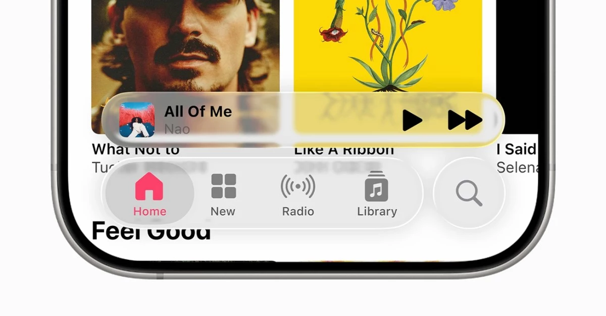
Apple’s decision to temper the bold translucency of its “Liquid Glass” interface in the third developer beta of iOS 26 marks a nuanced, almost theatrical recalibration of its design ethos. The initial unveiling at WWDC was a technical flex—silicon-accelerated compositing, HDR color pipelines, and a visual language that shimmered with possibility. But as the developer community engaged with the new interface, the limits of legibility and cognitive comfort became impossible to ignore. The result: a subtle but significant rollback in transparency, particularly across navigation bars, buttons, and tabs.
This move is not mere cosmetic tinkering. Rather, it is a window into Apple’s evolving philosophy—a philosophy increasingly shaped by the twin imperatives of accessibility and strategic adaptability. The Liquid Glass saga is emblematic of a broader industry reckoning, as device makers grapple with the realities of aging user bases, regulatory scrutiny, and the looming horizon of spatial computing.
The Human Factors Pivot and Context-Aware UI
The original Liquid Glass was a showcase of Apple’s technical prowess, but the beta’s retreat signals a renewed commitment to human factors. Excessive translucency, while visually arresting, can undermine usability—especially for users with declining eyesight or in high-glare environments. Apple’s shift toward a “contrast-first” UI aligns with a growing consensus among interface designers: accessibility is not a feature, but a foundation.
What’s particularly compelling is the emergence of context-aware rendering. Early reports suggest that iOS 26 dynamically adjusts transparency based on background luminance and foreground contrast, hinting at a sophisticated compositing engine that could one day algorithmically optimize UI elements in real time. This is more than just a technical flourish; it is a harbinger of interfaces that seamlessly adapt to user context, device capabilities, and even ambient conditions.
Such advances are not happening in a vacuum. The less-translucent UI is likely a strategic bridge to visionOS, where depth, legibility, and comfort are paramount. In this sense, iOS 26 becomes a proving ground—a sandbox where Apple can harmonize its 2-D and spatial interface guidelines before fully unleashing them in the mixed-reality domain.
Economic Ripples and Ecosystem Dynamics
Every adjustment to Apple’s Human Interface Guidelines reverberates through its vast developer ecosystem. The 36-million-strong developer community faces tangible, if incremental, costs: icons, overlays, and micro-interactions must be retooled to conform to the new translucency metrics. This reinforces both platform lock-in and the ongoing need for updated design toolkits, subtly tightening Apple’s grip on its ecosystem.
From a device portfolio perspective, clearer UI elements enhance usability on entry-level iPhones and older OLED panels—devices with lower peak brightness that are especially vulnerable to legibility issues. This move not only protects Apple’s installed base but also limits user churn to Android alternatives, especially in the mid-tier segment.
Apple’s careful balancing act is also a matter of brand equity. The company’s premium positioning depends on its ability to marry avant-garde visuals with effortless usability. By tempering Liquid Glass, Apple shores up Net Promoter Scores, warranty satisfaction, and upgrade intent—all critical levers for revenue diversification in services and accessories.
Strategic Signals and Industry Implications
Apple’s willingness to iterate on a headline feature during public beta cycles is itself a form of strategic theater. It projects responsiveness and humility, even as it maintains ultimate control over the platform’s direction. This is a valuable narrative as regulators intensify their scrutiny of platform power and digital inclusion.
The recalibration of Liquid Glass also serves as a preemptive strike in the arena of accessibility. By foregrounding readability, Apple positions itself ahead of potential litigation or regulatory mandates—particularly as global standards like WCAG 3.0 tighten contrast requirements. The move is especially prescient given demographic trends: aging populations in key markets are driving demand for interfaces that prioritize clarity over novelty.
For executives, product leaders, and investors, the implications are clear:
- Expect a “contrast premium” as immersive, accessible products command higher margins.
- Plan for iterative redesigns—Apple’s true UI direction now emerges in beta cycles, not just at keynotes.
- Monitor for new developer tools that automate contrast compliance, signaling a broader shift toward UI governance by algorithm.
The industry should also keep a close watch on upcoming milestones: the September GM seed may introduce per-app transparency APIs, and the fall hardware event could reveal how iOS 26 conventions migrate into spatial computing SDKs.
Apple’s recalibration of Liquid Glass is more than a tweak—it is a strategic synthesis of user-centric design, regulatory foresight, and spatial computing readiness. Those attuned to these shifts will be best positioned to ride the next wave of interface innovation, minimizing compliance risks while capturing new sources of value.


 By
By
 By
By
 By
By
 By
By

 By
By


